UX Research
Concept App
Overview
June-July 2016
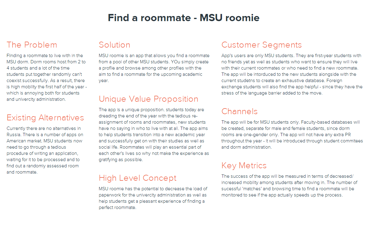
Being a student at Lomonosov Moscow State University and having to live in the dorms for five years, I myself have encountered the problem of finding a roommate and then applying for a room (which has to be redone at the end of each academic year). For my concept app, I decided to approach this problem and try to make students’ lives a bit easier.
My app is aimed at MSU students only, so it focuses on the reality where first year students live in rooms with up to four people living together.
Needfinding and Research
In order to make sure that the app would be desirable, I started off with interviews of current students. I wanted to identify the needs of students, to figure out what goes into the process of choosing a roommate and how much do people even care about having a say in the process of random assignment. I conducted in-person and remote interviews.
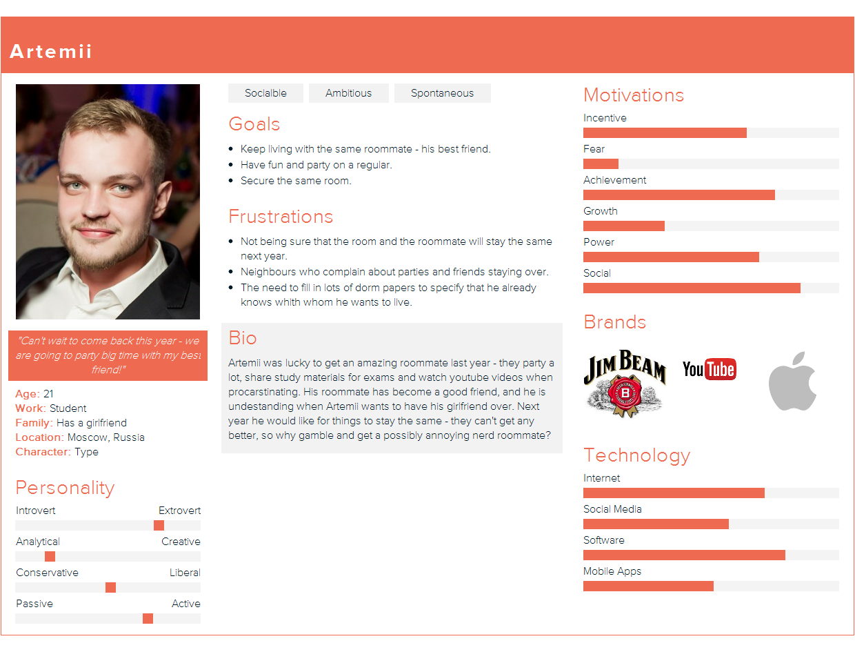
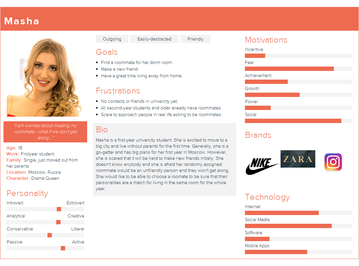
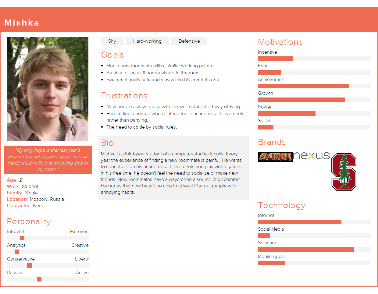
After the goal of the app was clear, I turned to personas. Three types of personas were distinguished – first year students who have no connections yet, and current students who in turn either do not have a roommate to live with but have a good idea about who that could be. Some students focus on academic achievements, others on socializing and it is important that all of them have suitable conditions to live and work in.
I researched existing practices in the world – Russian market does not have app like that yet, while USA has a number of options. I studied American solutions to the problem and identified best practices. I researched other social apps aimed at choosing a friend/a partner.
Finding the best solution:/Sketching and testing
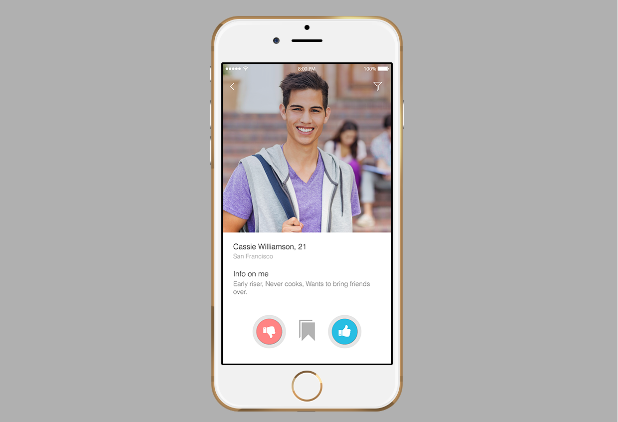
I made storyboards with basic scenarios of how and why the app can be used. From there I went on to sketch and create a few screens, which I tested on potential users. With the aim of finding what works best, I sketched a number of solutions and made them into interactive screen sequences with the help of POP app. Testing helped me figure out which features were important for users and which were not – the ‘game’ layout was more enjoyable than a simple grid one. Since the app felt like a game, the filter option turned out not that important: generally, people who had someone particular in mind need the search.
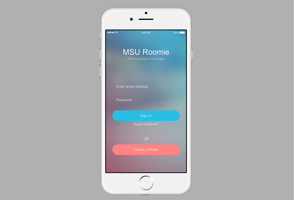
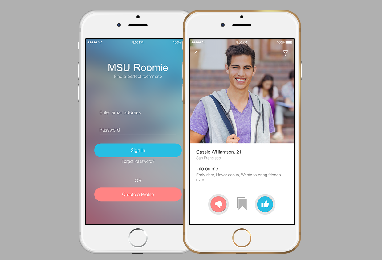
At this stage, I started working on higher fidelity screens in UxPin, making an interactive prototype. I followed up by more user testing. The bookmark option was added through testing, because some people found it hard to make up their minds until they saw more options.
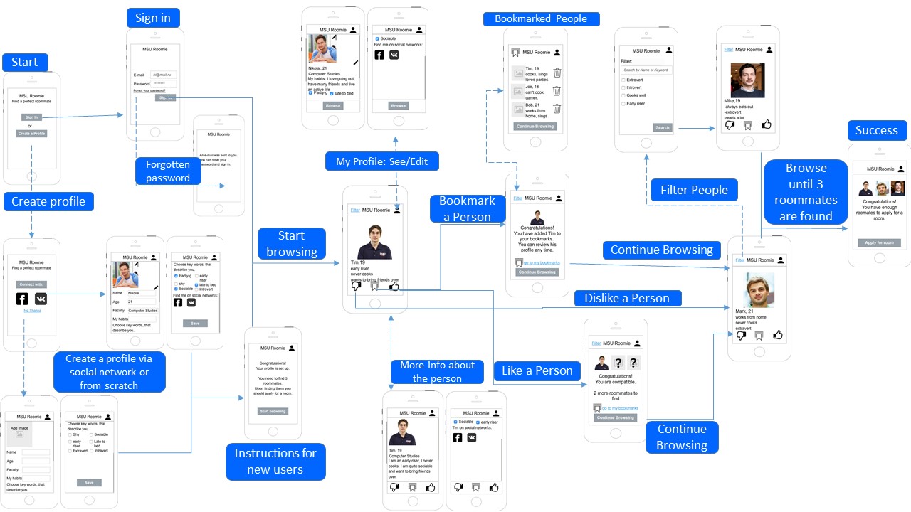
After iteration and validation through user testing the wireframes were handed off to UI.